Ride Design Livestream
Garret will be doing another ride design livestream next week!
If you want to watch how he models a new ride for the game and maybe give him some instant feedback or talk to us you can tune in to his Twitch channel on Friday 21st at 12pm PST. It’ll probably take until ~2pm PST.
We’ll upload a timelapse to our YouTube channel afterwards.
This weeks progress
Alright, on to this weeks progress! As expected it’s all about UI and will stay so for a while. Since most of the UI looks about the same these next few devlog entries might not be the most exciting but anyways! It’s gotta be done :)
The first priority for now is to get the UI working at all. We’re using Unitys UI features that are brand new in the 4.6 beta version, so we’re still learning the best ways to solve things and are figuring out the workflows for putting everything together. Also, since we’re working with a beta version of Unity we sometimes stumble over some bugs, but the Unity team is pretty good and fast with ironing them out.
Then, once we figured out how everything should work and it is functional we’ll do a second pass and figure out how to make it look better.
I started the UI implementation with the shop builder since that’s a fairly uncomplicated and self-contained component. It’s really just a list of items with an icon and label:
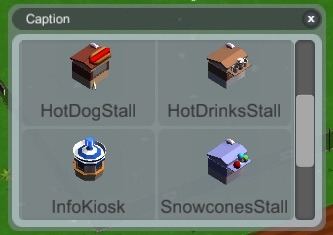
Good enough for now!
Next I started creating the track builder which is probably one of the more complicated UIs we have to create. It’s still missing tons of features but apart from that it probably looks pretty much as you’d expect:
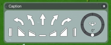
We had to design and implement a custom UI element for the banking level controls. Here it is in action!
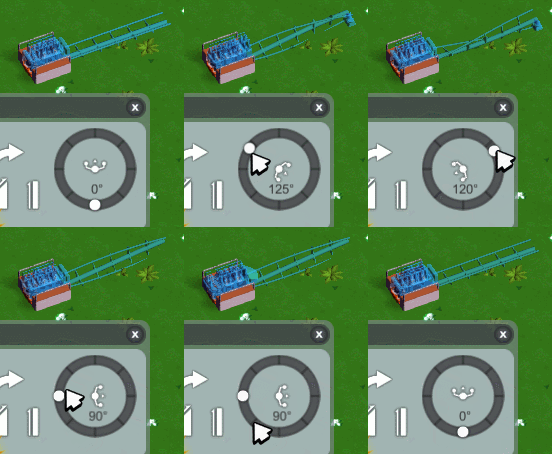
It snaps to angle increments of 5° which should be fine-grained enough (anything less would make it really finnicky to use and would not add much value). When holding the shift key it snaps to increments of 45°.
Besides UI work, Garret redid the paths this week. Before they had more geometry (left), now they are just a flat quad (right) which is a bit cheaper to render and looks the same in game.
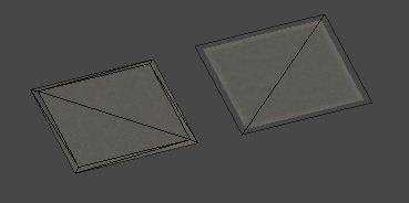
The new paths have some additional tiles for wider paths (not used yet) and there’s an extra piece for connecting to shops:
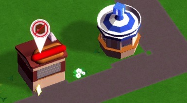
They should also be easier to reskin for different types of paths.
And he redesigned the game logo!
