Devlog Update 214 + Beta 11

Beta 11 is now available for download! The full change log is at the end of this post.

Devlog

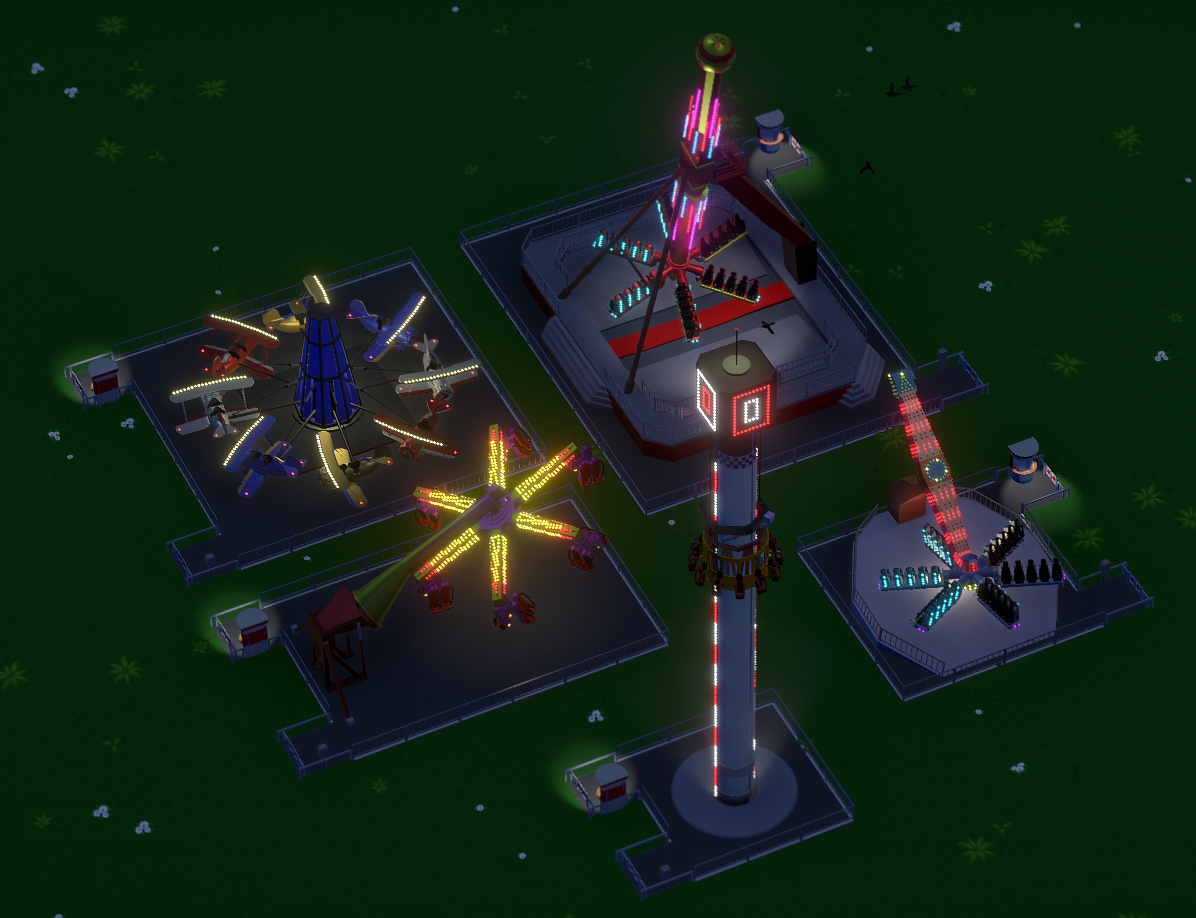
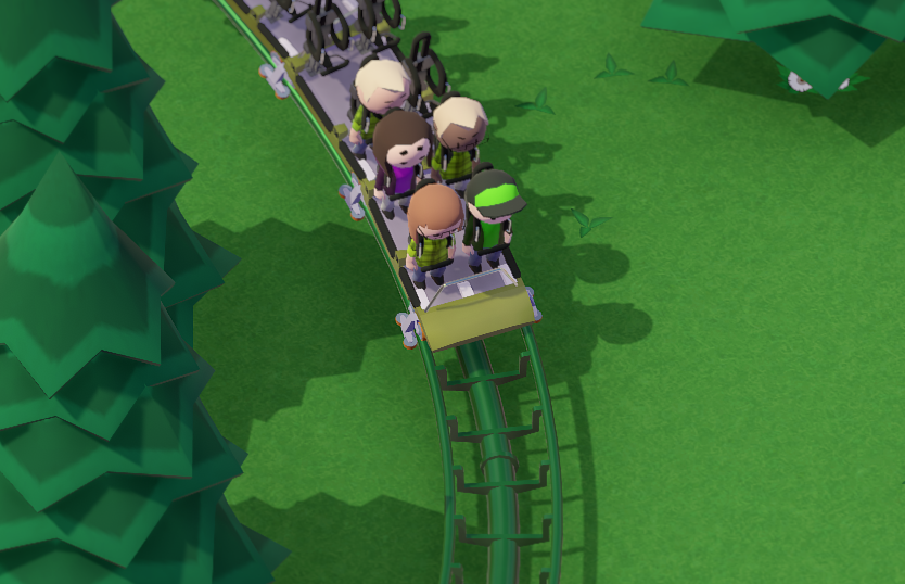
We added the Stand-up Coaster from this months Art Stream:

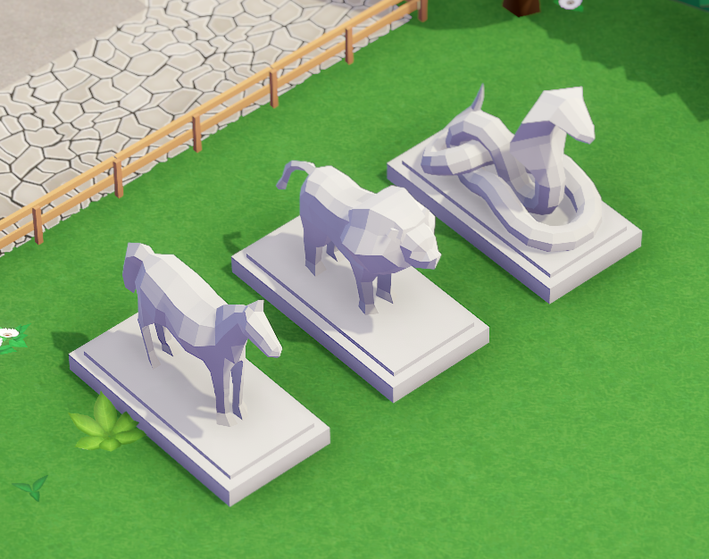
And Fabrice made three new animal statues:

Changelog

- added Stand-up Coaster
- added Trash Chute utility building
- added more animal statues
- added operating profit scenario goal
- added fences around purchasable land
- added guests can take photos
- added utility building door animations
- changed how loans work
- improved build previews
- improved all build windows to minimize while building
- improved grid snapping to snap to grid center + corners at once
- fixed a case where deco objects could remain stuck to the mouse after building
- fixed a case where ghost train would be missing when editing a tracked ride
- fixed a case where wrong stats would be reported while editing a tracked ride
- fixed a case where guests could buy something from a closed shop
- fixed a case where guests would face the wrong direction while watching a ride
- fixed not being able to change car rotation/train speed on helix pieces
- fixed not being able to select fog effect in blueprints/bulldozer tool

Devlog Update 213

Art Stream

Come join us on Garrets Twitch channel on Wednesday (September 26th) at 1pm PDT to chat while watching some new Parkitect art being created

Devlog

We added a new utility building! The Trash Chute is a small and relatively cheap way to quickly transport trash bags to the trash dump. It needs to be connected to the Deliveries Building with the transport pipes.

So far trash bags could also be dropped at the Depot. We’ll probably remove that.

All build windows minimize now to get out of the way while you’re building something, like the deco window already did:

There’s also this new “slide in” animation when the window minimizes. This is not just for aesthetics. I oftentimes noticed people got confused where the deco window went after it instantly minimized and thought they need to re-open it. This quick animation should make it a bit more clear what happens with the window and that it’s still there.

Utility building doors finally received animations.

Devlog Update 212

Purchasable terrain is now surrounded by a fence. It was previously hard to discover whether a scenario has any purchasable terrain or not because you had to first open the land tools and then switch to the terrain purchasing tab.
This should make it much more clearer and remind you that this option exists.

The loans had a rebalance just recently. They were still not working too well though, so we’re changing them some more. Previously you were actively paying them back and they were running for a certain time, but none of it really mattered. As player the only important thing is how much money you get and how much you need to pay, so we simplified loans to just that.
You have to manually pay back the loan yourself now. This also gives you the option to only pay back a small part of it to reduce the monthly fees, which should be slightly more interesting as well.

Devlog Update 211

When you place an object in Parkitect, we give you a semi-transparent preview of what you’re building. It looks like this:

We had this look since the start of development without much change. In the beginning, when the game only contained some simple flat rides and shops that you could place this worked well enough. As the game grew, we added scenery objects that can be placed freely and that can be recolored, or blueprints that allow you to place thousands of objects at once, and these build previews did not work as well anymore. They looked quite messy and even made it somewhat difficult to see what you’re doing at times.
Last week we changed the build previews to look like this:

Apart from generally looking nicer and giving you a much clearer look at what you’re building, the added shadows help a lot with figuring out how far away from the ground the object is. Removing the transparency makes it a bit easier to see how the object intersects with the terrain or other things.

And we changed the way grid-snapping works. It now snaps to both the grid centers and corners at the same time:

The old way of toggling between these options wasn’t intuitive at all. New players frequently didn’t figure it out, which made building annoying. Removing the toggle behaviour also reduces necessary key presses.
On the downside it might be a bit more fiddly than before since there are more snap positions, but we’ll deal with that if it actually turns out to be a problem.