Garret will do another livestream this week! Tune in to his Twitch channel on Saturday from 1pm to 3pm PST to watch him create some new art for Parkitect.
Art Stream
Update 37
We upgraded our shaders to Unity 5′s new PBS system, giving us slightly nicer looking lighting. We also added a bit of rim lighting.
Here’s a comparison showing before (Unity 4) and now (Unity 5):
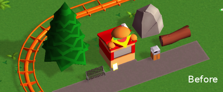
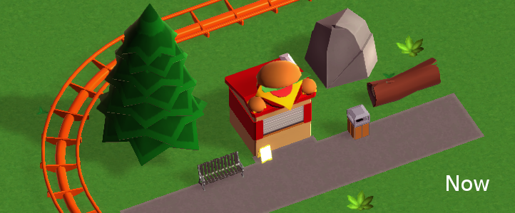
The difference is small, but it’s noticeable (note the top of the burger or the tree). As a bonus it allowed us to get rid off a couple of shader variants.
You’ll notice that shadows are slightly softer/nicer too, but we simply got that from the switch to Unity 5.
Supports and paths properly react to terrain changes below them now:
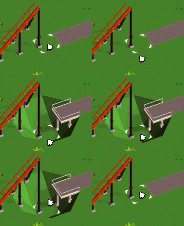
You can still raise the terrain to “bury” stuff though, but that’s a different problem.
Tracked rides received s-bends:
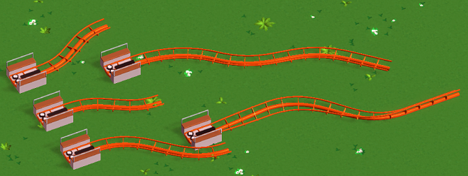
They can be scaled and banked and built diagonally like most of the other track segments.
And we finally replaced the weird old loops we’ve been using pretty much since the beginning of development with some properly shaped ones:
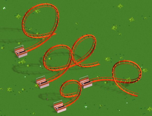
They look a bit circular due to the perspective, but they really aren’t. Here’s a before/now comparison:
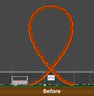
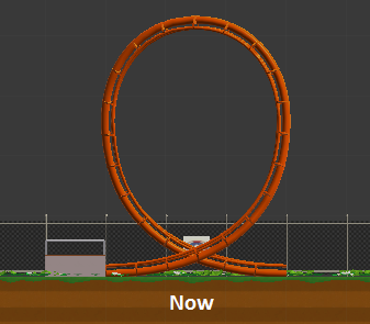
Thanks to everyone over on our subreddit for helping to make sure we get them right this time :)
Update 36
We haven’t done a lot of UI work in a while, but now that shops can finally be selected it seemed like a good time to start with the shop info window.
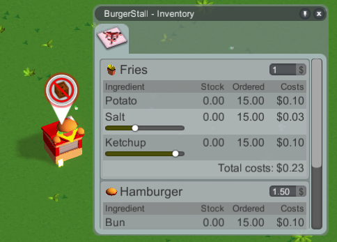
What we have here so far is the product settings tab, listing all the products and their required ingredients (which need to be delivered to the shop). For some ingredients you can tweak how much of it goes into the product, so you have a bit of an influence on how many delivery crates need to be hauled around and the production costs. Guests might not be willing to pay as much/are less satisfied with lower quality products though.
Most ingredients have a status effect on the consumer (for example, coffee reduces tiredness a bit), so you might not want to be too stingy with those.
Adjusting the ingredient amounts should not really be required in the end as that could easily become tedious, but it’s something you can do if you want to.
The costs in the screenshot above are placeholders. We’ll have to do a big balancing pass someday and assign some proper values.
The tunnels from last week received their art and work for other coasters now too:
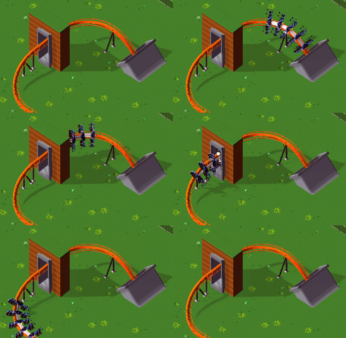
They’re just simple concrete tubes, but that’s what a lot of real coasters use. We might add other types of tunnels later - for now though I’m pretty satisfied with these.
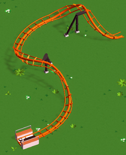
Working on the coasters wasn’t really planned for this month, but after the work on tunnels I felt like it and the result is that corkscrews can be built diagonally now:
Same for regular hills:
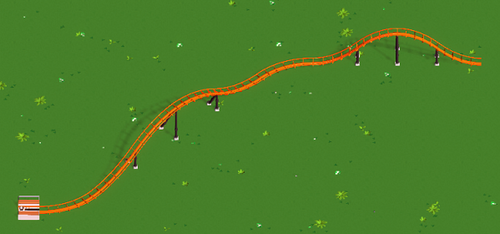
Naturally, diagonal elements are a bit longer and thus have a slightly different shape, but that’s the trade-off for keeping everything properly aligned.
Here’s a comparison showing the shape difference of diagonal hills (orange) and regular ones (blue):

I was told that it would be a good idea to allow building brakes on flat slopes, so that’s possible now:
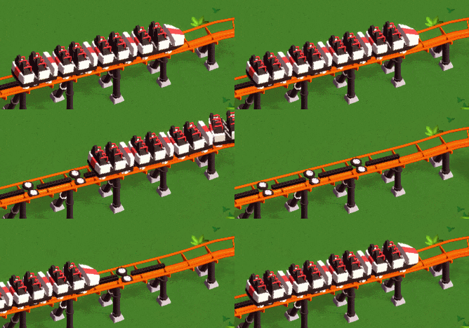
I think it’s mostly useful for accelerating a train out of a block brake a little bit quicker.
The drive tires and brakes received some simple animations.
We’ve added a follow camera mode for guests:
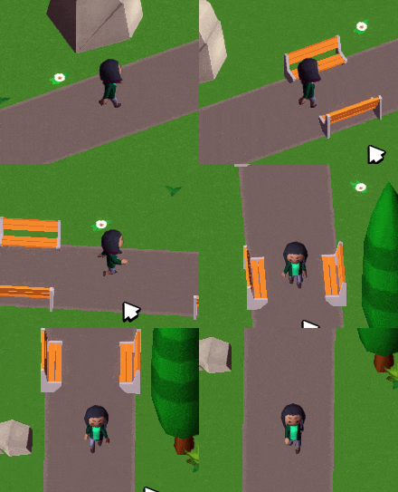
More things than usual that we did this week were possible to show on a screenshot/gif and interesting enough to show here, so this got a bit longer :)
Too bad not every week is like this!
Update 35
As said last week, this month we’re trying to focus on resolving smaller tasks that have slowly piled up over time. It might make the next couple devlog entries a bit less interesting, but it’s gotta be done!
Unity 5 was released earlier this week, so we finally switched over! Despite having one of the longest changelogs I’ve ever seen it went super smooth though. There were only a couple minor issues that were easy enough to resolve, and now we’re using Unity 5 :)
We’ll need some time to learn all the new features that are suddenly available to us, but I’m pretty excited about the switch.
If you’ve seen any of the videos of some of our KS-backers playing the game you’ll have noticed that it was impossible to delete certain things after they’ve been placed. The reason was that in Unity 4 we were experiencing some weird performance drops when making objects selectable…before cooking up my own solution for this I wanted to wait for Unity 5 though and see if it’s fixed there - and indeed everything seems to be fine now, so placed objects can finally be deleted. :)
We’ve also added some additional guest animations this week that would have been a pain to implement in Unity 4.
There’s now a search bar in the deco builder window:
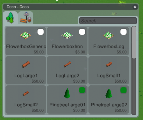
Not like there’s so much stuff already that it’s needed, but it’s probably best to have this early.
The preview icons fill the available space a bit better now, while still giving a rough idea of scale (at least when you compare similar items to each other, like the logs or trees).
A part of the finance overview from Update 32 is now also available as a tooltip when hovering over the overall money in the main menu (and it got an additional “Overall” bar).
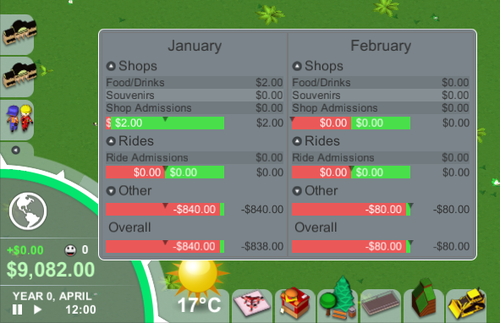
It shows the current and previous months, so you can get a quick overview without having to open and close a window.
Added a height number when building raised stuff:
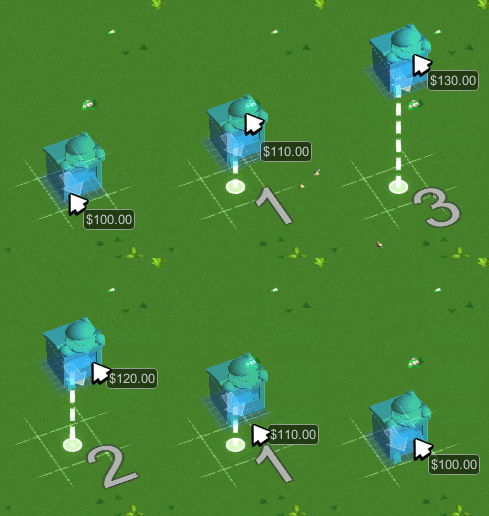
It currently shows height above ground level, we should change that to height above sea level instead.
I finally decided to give coaster tunnels a try today. Having to implement this was one of the things that’s been giving me headaches for months, but after having a reasonable idea of how to approach this it turned out to be really easy.
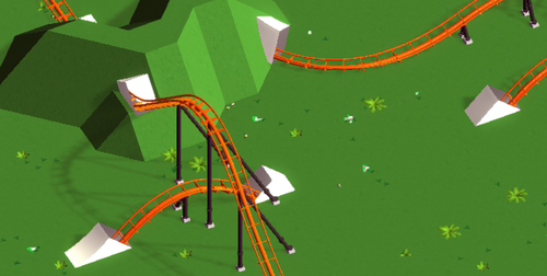
The white box look is obviously placeholder and will be replaced with proper art. Garret visited GDC this week though, so all you get for now is my programmer art :)