Update 42

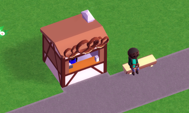
Garret will be doing another art livestream next week. Watch his Twitch channel on Wednesday from 1pm-3pm PST to see him create some new Parkitect art.

This was pretty much the least interesting week imaginable for the devlog, since we spent it entirely on testing the game and fixing bugs. Amongst others Garret brought the game to Full Indie to let people try our most recent version. The area requiring the most fixes turned out to be the savegames: there’s a lot that could potentially go wrong when trying to restore the state of thousands of objects, and failing to restore one single object properly can oftentimes cause a domino effect that makes others load wrong as well. Made some good progress here though, and we also got some new tools that should help with debugging savegames in the future.

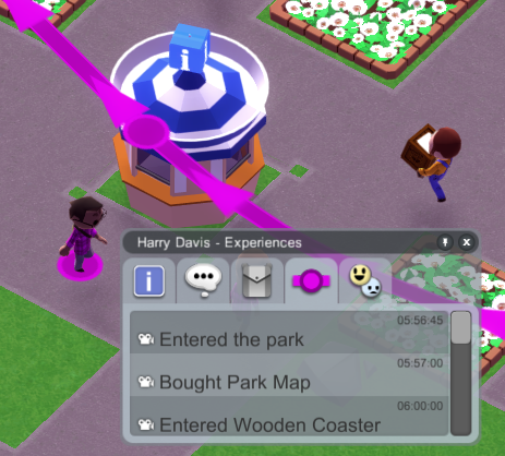
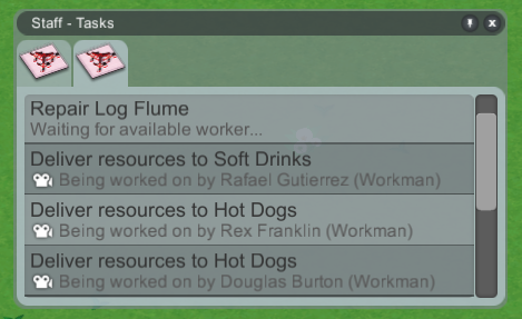
The only truly visible progress this week is this list showing all the tasks that need to be completed by your staff:

This one started out as a debug tool as well, but it turned out to be useful for players too.

I got myself a Mac Mini this week for testing Parkitect on OS X. It needed some fixes as well, but is working fine now :)

We decided to submit Parkitect to IndieCade. The deadline is May 1, so next week will probably be spent on similar tasks as this one to get the game into the best shape we possibly can by then.

And we made ourselves a long list of everything that needs to be done for the Early Access release. Lots to do!

Update 41

We’re working towards the release of the second pre-pre-alpha build for our $100 tier Kickstarter backers now, so a significant amount of time is spent on fixing bugs and finishing/improving unfinished stuff. Overall I’d say we’re in good shape though, it feels like there’s less to do than for the first build. I’m really glad we’re doing these small intermediary releases before the big public Early Access one…it forces us to have a somewhat stable game at all times, which should help to reduce crunch times.

The log flume received its conveyor belt lifts:

We finally added the ¼ height slopes to the track builder. We can also put seperate limits on up/down slope heights for tracked ride types now (notice how the log flume can have steep down slopes, but not steep up slopes). And we can put minimum size restrictions on slope transitions - the high and medium slopes in the back are the smallest possible sizes you can build, but the high slope transition is a bit longer.

I‘ve started turning last weeks water graphics test into water that you can actually build in the game:

Could use some splash effects, but this’ll do for now.

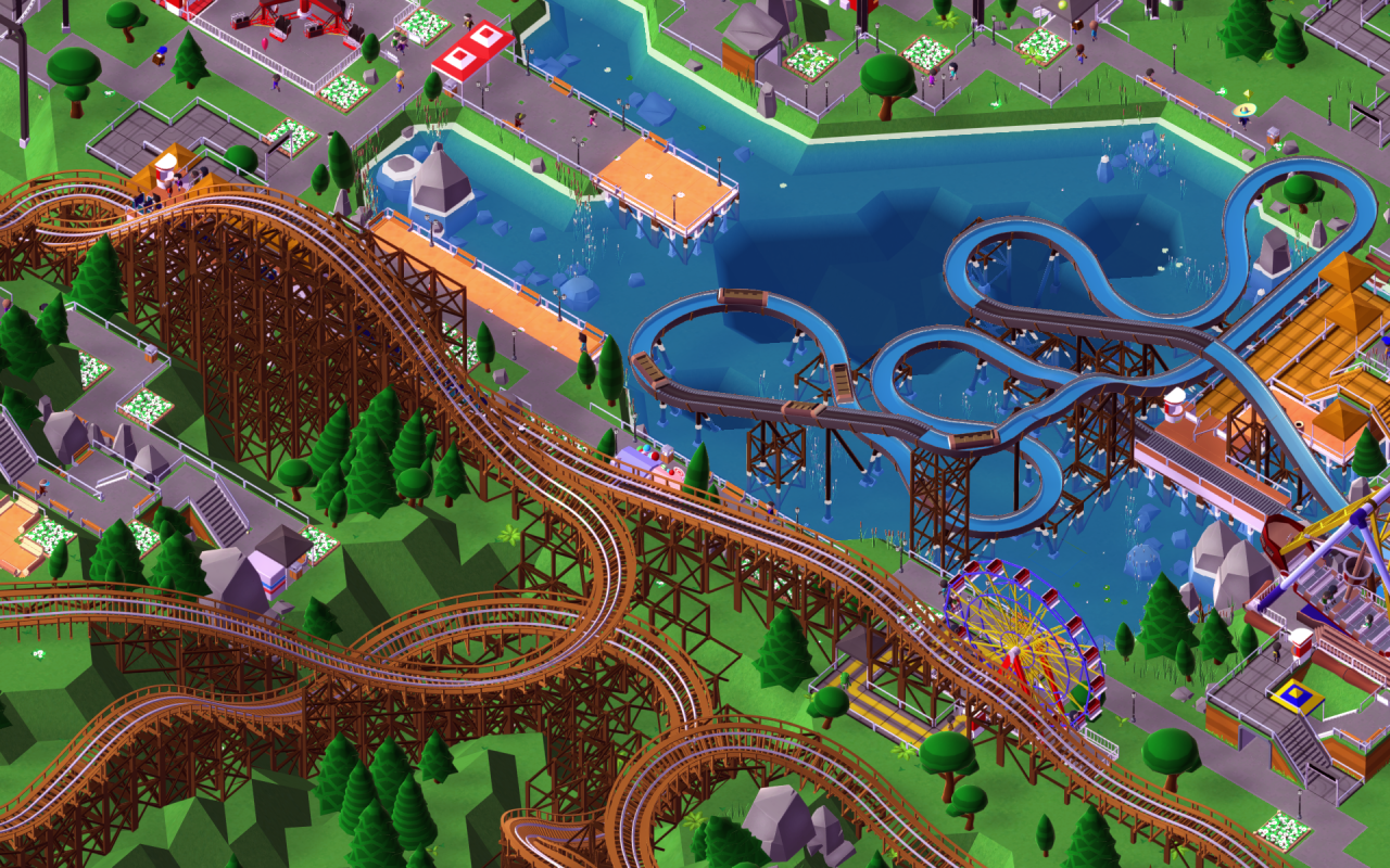
Garret made these nice replacements for the placeholder wooden supports:

And here’s some new scenery - and path tunnels!

Garret had some fun with all the new stuff and built this nice little swamp park :)

Update 40

We’ve got a fairly big technical decision to make this week: should we switch to deferred shading?

Deferred shading is a technique that allows using lots of high-quality point lights without killing your PC. That means we could do this (and many more lights on screen at once) with good performance:

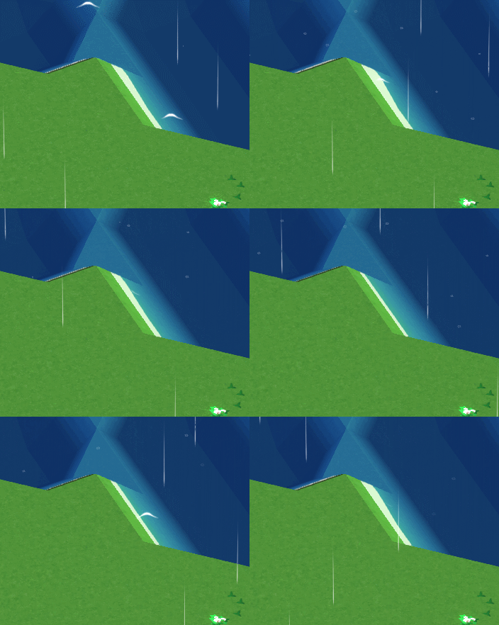
And we could also fairly cheaply shade water based on depth:

The water could probably be done without deferred shading, but if we ever want to have the lights we definitely need to switch.

Now, please note that the above screenshots are currently nothing but graphics tests: they are taken in-engine, but it doesn’t get dark in the game yet, and you can’t place water yet either. Water is something we just started working on this week (which is why the deferred shading question popped up now). Lights is something we’d like to do potentially: we’d love having them, but placing them on rides and animating them will take lots of time. Since lights are really just eye candy (although we think they look fantastic) that time is currently spent better elsewhere. Basically, for now we’d only like to keep the door open to maybe add lights sometime further down the road.

Now, the downside of switching to deferred shading is that in Unity it doesn’t work together with the orthographic camera we’ve been using so far. The above screenshots have been taken with a perspective camera with a very low field of view to match the previous look of the game as good as possible so you might not even have noticed that it changed. It’s most noticeable on very tall straight structures like the drop towers if they are near the edges of the screen. Here’s an extreme example:

(Left: what the tower would look like with the new perspective camera; right: what the tower looked like with the orthographic camera used so far).

Tall structures look slightly bigger the closer they get to the camera, which they didn’t before.

Here’s a more normal scene for comparison. Old orthographic camera:

New perspective camera:

(Ignore the shadow differences, they are super blurry as a result of the switch right now. We’re looking into fixing that.)

It looks almost identical, but as you can see we’d still move slightly away from that oldschool isometric look, so we wanted to hear your opinion on this before doing the switch (and no, allowing to toggle between both is not an option). We’ll keep working with it for the next few weeks to see if there are any other benefits/downsides, but we can relatively easily switch back if the majority of you hates it.

Other things done this week

In other development news, I’ve started doing some balance work as mentioned last week. I’ve created a small tool that records the duration of flat rides. The problem is that not all of our rides use simple animations - for example the Swinging Ship uses some simple pendulum physics, so the only way to figure out how long it needs for a round is to let it go and measure the time, and this tool does just that. It’ll also be helpful for testing the animations of future rides more quickly, as I don’t have to boot up the entire game and place down a ride manually just for watching what happens.

Using the duration information I created another tool that gives us an overview of all the flat rides in the game and that calculates some important numbers that tell us how “good” the ride is, like the maximum number of guests who can be served per hour and how much money the ride can theoretically make in that time. All rides got some different stats now. They’ll need further tweaks, but it’s pretty cool to finally see guests prefer some rides more than others depending on their personal taste.

Also did some work on a park rating system:

That greenish quarter circle in the menu bar shows your current overall rating. If you hover over it, you get this tooltip that explains where the overall rating is comeing from. As you can see your park rating is broken down into several categories, and we’ve got plans for a couple more. Happiness is the current average of all your guests in the park. Price and cleanliness are running averages over ratings given by each individual guest as soon as he leaves the park (so they depend on what each guest experienced in your park and their personal opinions). We’re doing ratings in percent because we think that makes it intuitively pretty clear that 0% is the worst possible rating, 50% is neither good nor bad and 100% is the best possible rating.

And, finally, now that we have an idea what water might look like in this game, we just had to add a log flume ride:

We might still change the look of the water a bit and maybe add some visuals to show the current, but overall we’re pretty happy with it.

And that’s it. That was a pretty crazy week :)

Update 39

This week has mainly been more smaller fixes and improvements. One of the more notable changes I guess is that guests don’t spawn randomly anymore (was placeholder code), but based on the attractions in your park and the park rating. Since we’re still using placeholder values for determining the attractivity of a ride it currently spawns way too many guests though. I tried to hold off on doing any game balancing as long as possible, but I think it’d be a good idea to at least start with it soon since we’ve got a couple of systems implemented now that need to work together. We won’t get the balance right on the first try anyways and it’d help to get a bit of a feeling for it.

The new audio tools in Unity 5 are a big improvement over the ones in 4, but they’re still pretty basic. Gordon linked me to Fabric, a huge extension for Unity’s audio functionality. It should do everything we need out of the box, so I’ve added it to our project this week.

The Observation Tower that Garret created during last weeks livestream is in the game now:

Building it works just like last weeks drop tower.

And here’s the timelapse of the stream:

Getting the wooden coasters to look good is probably the hardest out of all rides and I was never really satisfied with them. Here’s an old screenshot from August last year:

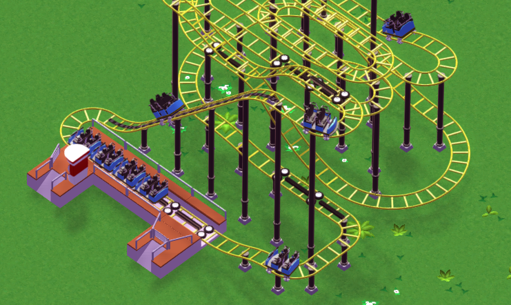
And after a bit of work this week they now look like this:

The main issue with the old supports was that they were just textured quads which made them look more like they’re made out of paper than wood, especially when viewed from certain angles. They’ve been replaced with real geometry (paceholder art, by the way) which automatically makes it look better (but we got to keep an eye on performance - seems fine so far though). Their placement is also more precise and they react to terrain changes like the steel supports. There are still some issues but I think it’s going in the right direction now.