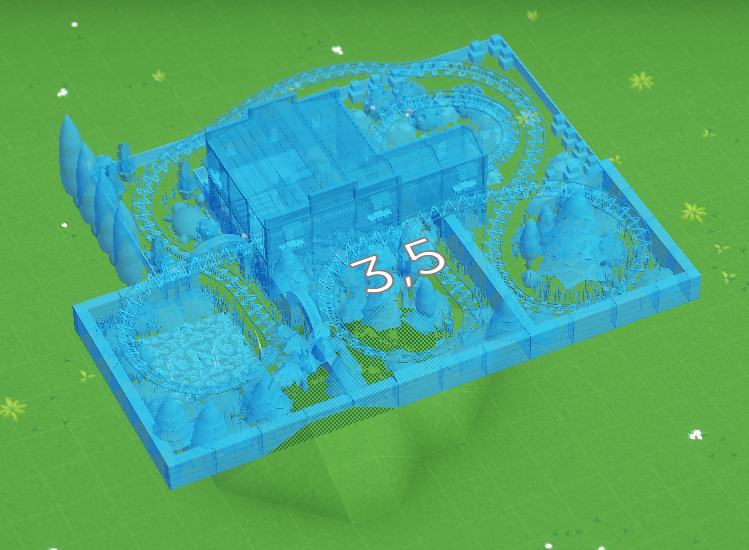
When you place an object in Parkitect, we give you a semi-transparent preview of what you’re building. It looks like this:

We had this look since the start of development without much change. In the beginning, when the game only contained some simple flat rides and shops that you could place this worked well enough. As the game grew, we added scenery objects that can be placed freely and that can be recolored, or blueprints that allow you to place thousands of objects at once, and these build previews did not work as well anymore. They looked quite messy and even made it somewhat difficult to see what you’re doing at times.
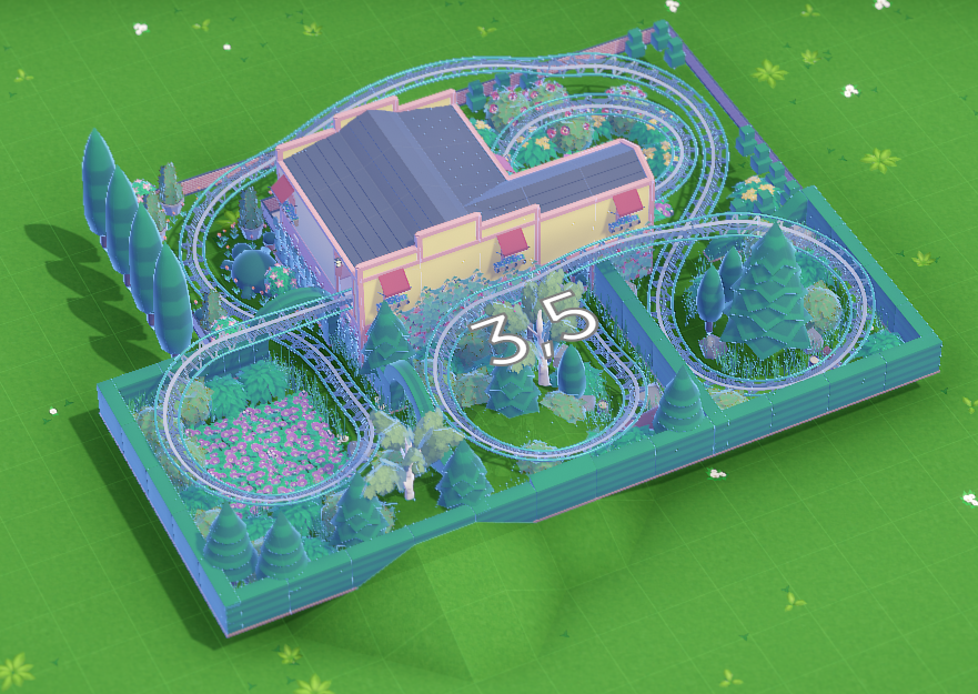
Last week we changed the build previews to look like this:

Apart from generally looking nicer and giving you a much clearer look at what you’re building, the added shadows help a lot with figuring out how far away from the ground the object is. Removing the transparency makes it a bit easier to see how the object intersects with the terrain or other things.
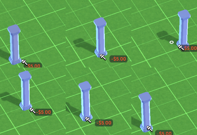
And we changed the way grid-snapping works. It now snaps to both the grid centers and corners at the same time:

The old way of toggling between these options wasn’t intuitive at all. New players frequently didn’t figure it out, which made building annoying. Removing the toggle behaviour also reduces necessary key presses.
On the downside it might be a bit more fiddly than before since there are more snap positions, but we’ll deal with that if it actually turns out to be a problem.