I’ve been excited to talk about this for months, so here we go :D
If you’ve been following the development of Parkitect for a longer time you might remember one of the most unique and technically challenging features of our Kickstarter pitch was “Maintaining the Illusion” - that scenery should not just look nice to the player, or have an “area of influence” effect on its surroundings. We wanted it to have a real management purpose, namely hiding the backstage areas of the park from the guests view.
Three months ago we sat down and discussed how to make this happen.
Tim and Luuk have been working on it since, and now we’ve got a really cool scenery rating system :)
First of all, let’s take a look at what exactly it is doing.
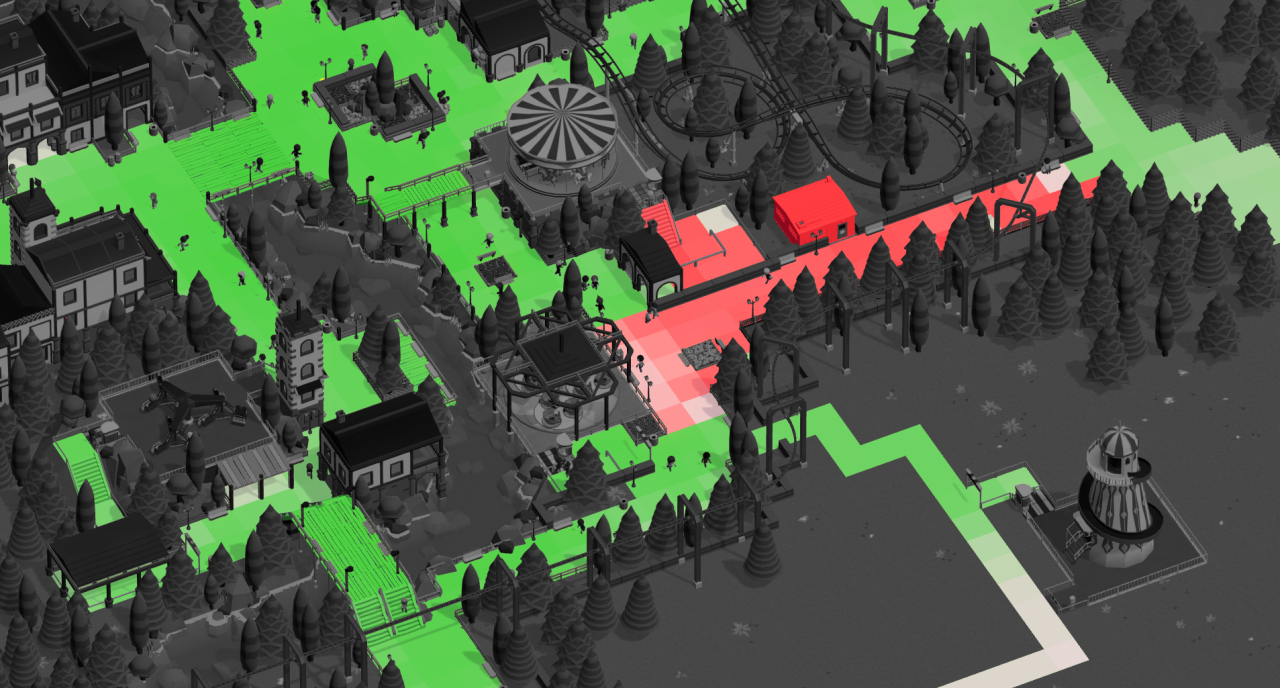
Here’s an overview shot of a park with a new scenery rating overlay, showing which areas of the park are nicely decorated in shades of green, and which aren’t in red:
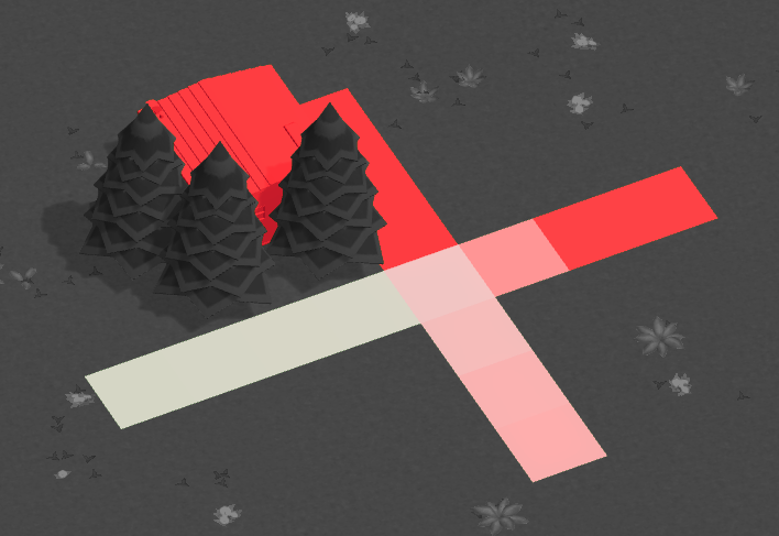
Guests don’t like seeing park utility infrastructure such as staff rooms, resource depots and employee paths. They have a negative effect on the scenery rating:
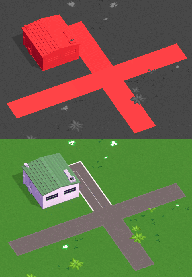
There are many things that are nicer to look at though and block the view.
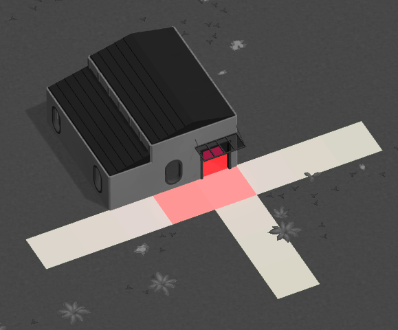
For example you could hide that staff room behind a facade
or completely enclose it inside a custom structure:
Or use the terrain to your advantage:
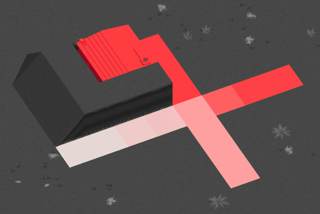
Or simply plant some trees :)
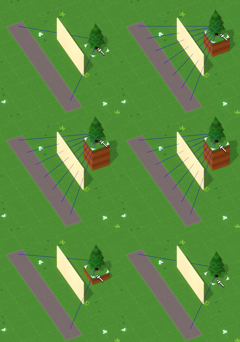
These visibility calculations aren’t just being done for the park infrastructure though - we’re doing it for every piece of decoration in the park. And in 3D!
Here’s a debug view where the blue lines show from which path tiles the tree is visible. As the tree moves up it becomes visible over the top of the wall!
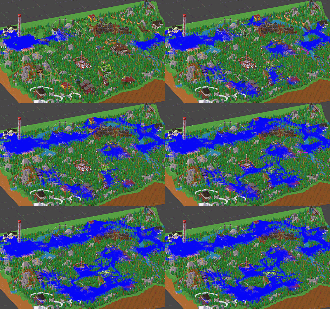
Here’s a bonus behind-the-scenes GIF (in realtime!) showing these calculations being done for an entire park. A lot to calculate in a short amount of time!
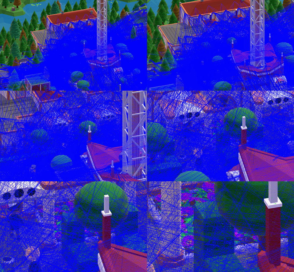
Seriously - a lot.
Next week we’ll talk about what exactly we’re doing with these scenery ratings and some other uses of the visibility system.